Putting the Sneaker Buyer First
Designing a marketplace that finally plays fair
PROGRAM
University of Central Florida
ROLE
Lead UI/UX Designer
TEAM
Team of 3
TIMELINE
Aug 2024 – May 2025
Context
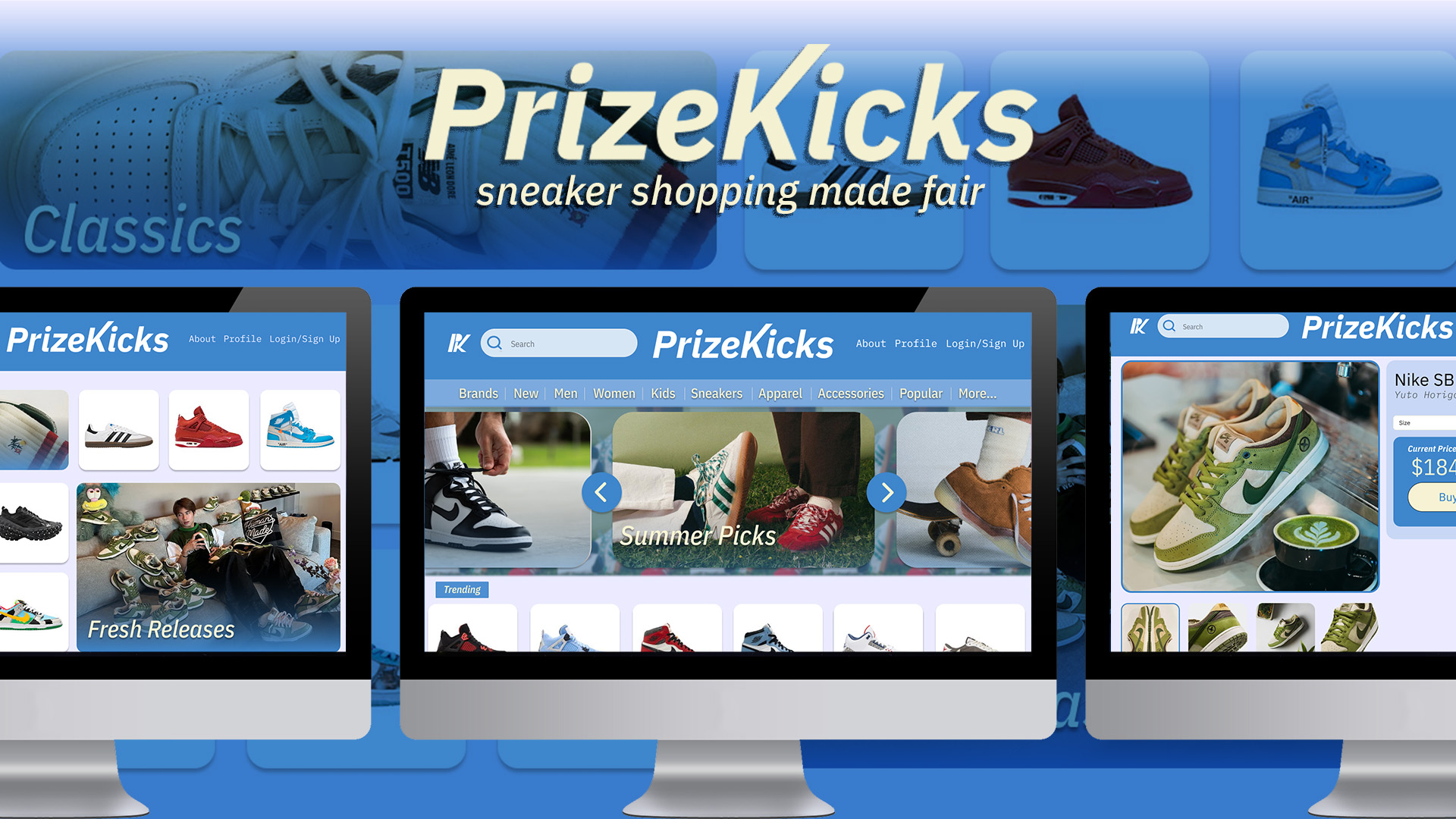
Sneaker resale runs on scarcity and hype, and the platforms built around it reflect that. Prices are opaque, interfaces are cluttered, and buyers are left guessing whether they got a fair deal or got played. Two classmates and I had all felt it. PrizeKicks was our answer. A marketplace that treats the buyer as the customer, not the mark.
I treated the research like it was the product. I led UI and UX from market analysis through two rounds of user testing and a live demo.
Overview
Project Type
University Group Project / Full Product Design
Summary
PrizeKicks is a sneaker marketplace concept built to bring price transparency and clarity to a market that offers neither.
Problem
Existing resale platforms bury product discovery under clutter and give buyers no signal for what a fair price looks like. Users leave frustrated or leave entirely.
Solution
A buyer-first marketplace with price comparison built into the browsing experience, a simplified information architecture, and a clean visual system that gets out of the way.
My Role
Lead UI/UX Designer (Market Research, Interviews and Surveys, Personas, Information Architecture, Wireframing, Style Guide, Prototyping, User Testing)
Tools
Figma, Adobe Photoshop, Canva, FigJam
Research
We started with the market, then went to the people shopping in it.
Cluttered by Default
GOAT, Grailed, and Flight Club all treated density as a feature. Finding a specific shoe meant fighting the interface first.
No Sense of Fair
I wrote interviews targeting price, frequency, sites used, frustrations, and habits, then ran a companion survey rating feelings 1 to 10. None of the platforms gave buyers a clear read on whether a listing was fair. Comparison meant opening tabs and doing the math yourself.
Trust Was Missing
Interviews and surveys kept circling the same theme. Buyers didn't feel these platforms were on their side, and that suspicion shaped every interaction.
Competitive Audit
I audited GOAT, Grailed, and Flight Club myself, cataloguing each against a shared feature matrix spanning nine marketplaces. Every platform had strong inventory and authentication, but little regard for the buyer's actual experience finding and trusting a listing.

GOAT
Vast selection with real authentication and pricing history, but shipping has no standard timeline and fees stack up around returns and verification.

Grailed
Negotiation-friendly and flexible on price, but it isn't sneaker-specific and authentication is looser, trading certainty for deal-making room.

Flight Club
Curated, authenticated, and backed by physical stores, but prices run high with no negotiation and a mostly-final sale policy.
Defining the Product
Research shaped four personas and a set of use cases that clarified what buyers actually needed from a marketplace, letting me hold the full range of buyers in view and see where their needs overlapped and pulled apart.
From there, a data dictionary catalogued every system the platform required, profiles, payment, notifications, trending, featured, reviews, price comparison, which became the backbone of the information architecture. We showed that architecture to potential users before designing a single screen and revised it based on what they told us.
From this, PrizeKicks' core goals were set:
Price Transparency
Fair price context on every listing
Clean Navigation
Find the shoe without fighting the interface
Buyer First
Hierarchy and features built around the customer
Trust Signals
Reviews and accountability baked in
Prototype
The research pointed to three things. Price context on every listing, navigation that doesn't fight you, and a hierarchy built around the buyer, not the seller.
The low-fidelity prototype covered the full shopping flow: sign up, home, search and filters, product pages, price comparison, checkout, and confirmation. We ran think-aloud sessions with users, catalogued every point of friction, and fixed them before moving to high fidelity.
A style guide locked in the visual identity, then the final prototype went through one more round of testing and refinement.
Results
Buyers Could Actually Compare
Price context on the product page removed the tab-juggling that defined every other platform.
Navigation Stopped Being Work
Testers moved through core flows without stalling. The second round of testing surfaced tweaks, not blockers.
Scoped to What Mattered
By cutting the marketplace down to the features that differentiated it, the final prototype demonstrated the product's value without pretending to be something it wasn't yet.
Reflection
PrizeKicks was my first full case study, and it changed how I think about the process.
Restraint Is a Feature
Our first plan was far bigger than what we could build. Cutting it back to the features that actually mattered made the product sharper. Knowing what to leave out is as much a design skill as knowing what to build.
Users Will Surprise You
Feedback caught me off guard more than once. I've come to think that's the point. The process exists because you can't predict everything on the first try.
Rely and Be Relied On
Leading design on a team meant trusting people with parts of the project I cared about. That exchange made the final product better than anything I could have built alone.