A Love Letter to Lo-Fi
Designing and building a cozy corner of the internet for the genre that got me through school
TYPE
Solo Project
ROLE
Designer and Developer
TOOLS
Figma, Adobe Photoshop, React, Spotify Web API
YEAR
2025
Context
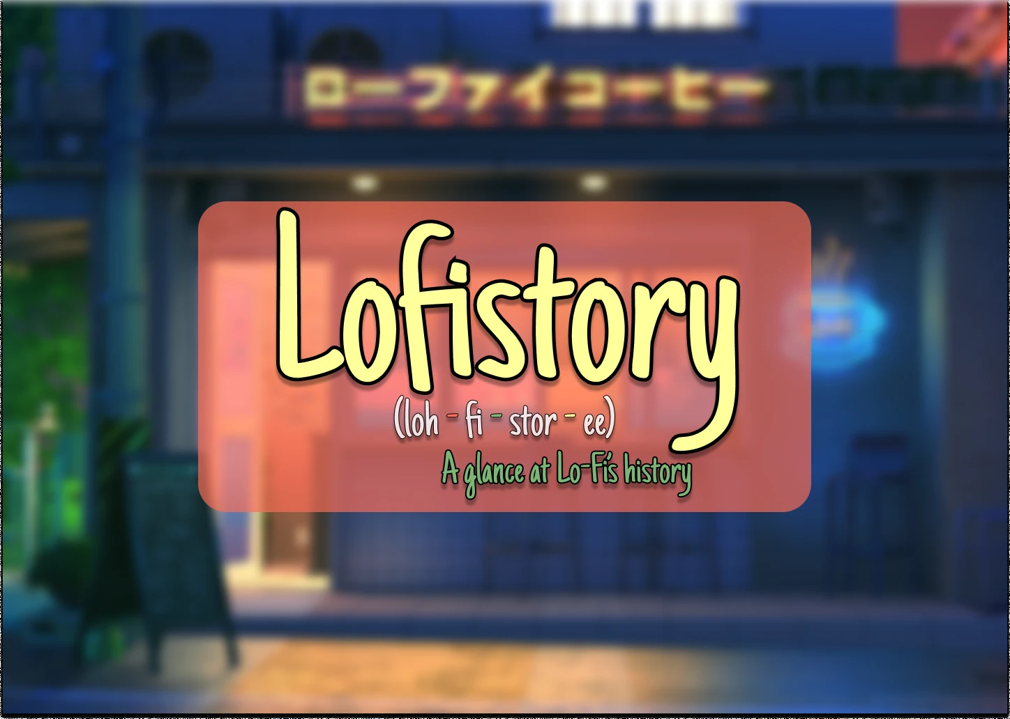
Lo-fi hip hop has been a constant companion through every late-night study session, every deadline, every render that took too long. It's a genre with an unmistakable visual identity. Ramen shops, rainy nights, the studying girl at her desk, the warm grain over everything. But when I went looking for a place that told its story, I found Wikipedia pages and playlist descriptions. Nothing that felt like the music.
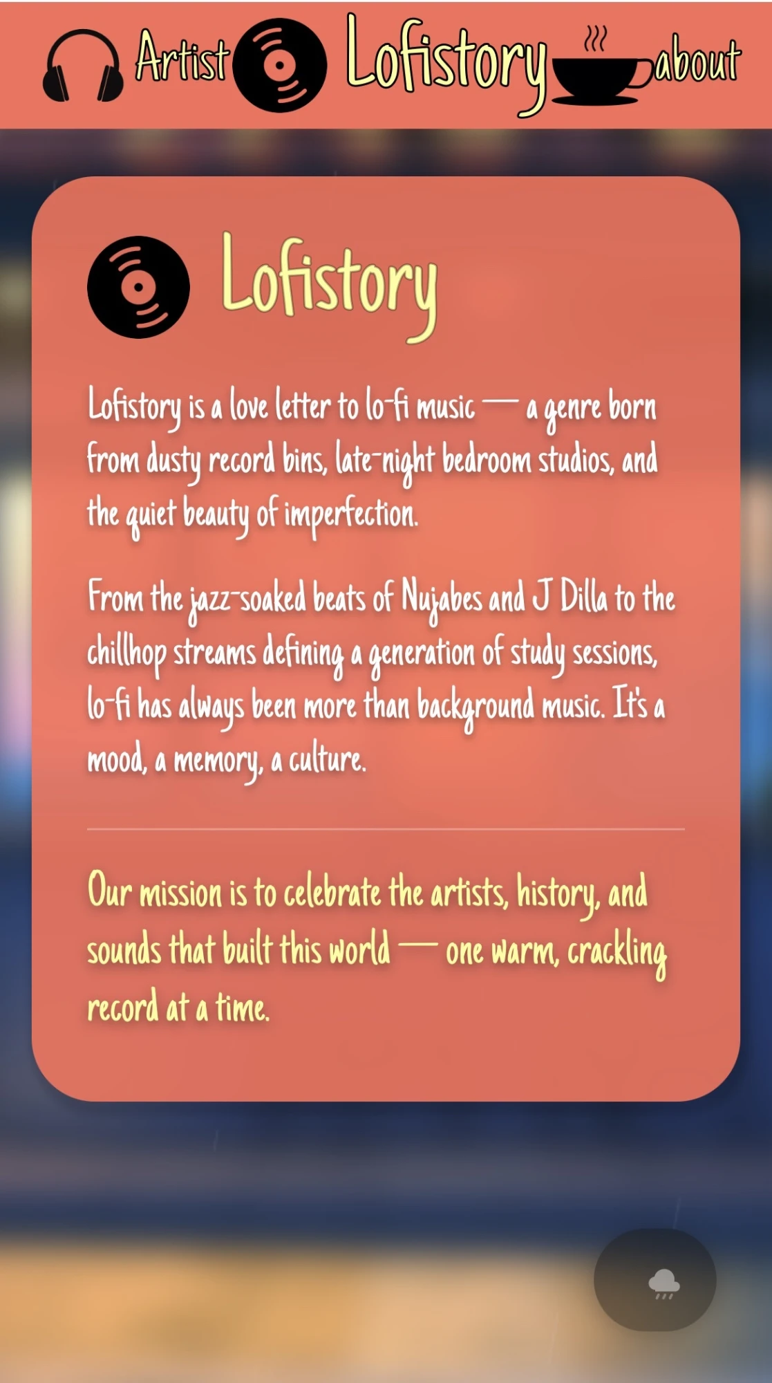
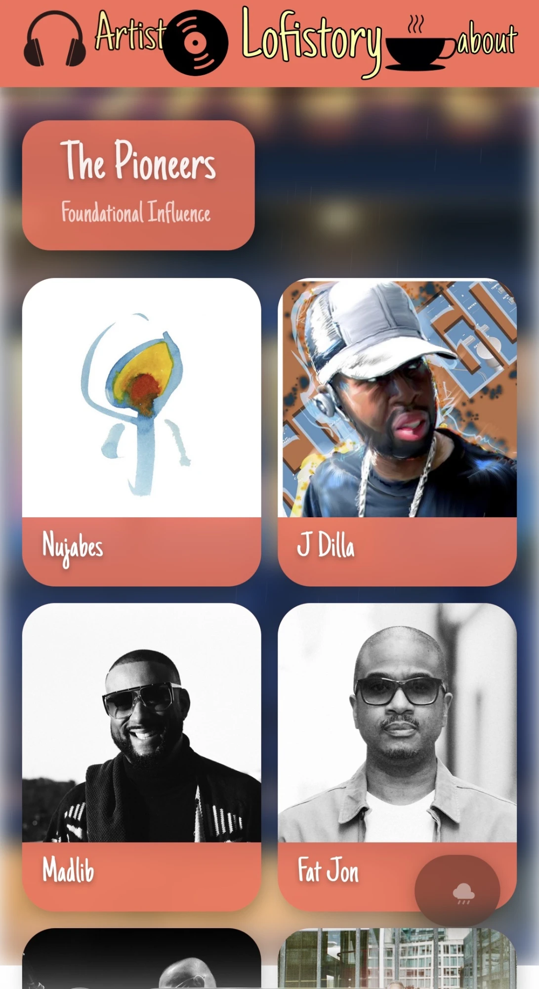
Lofistory started as a class design exercise and became something I couldn't leave as a mockup. It's a three-page site: a Home that sets the mood, an About that traces the genre's roots and conventions, and an Artist page that pulls the producers who shaped it straight from Spotify. I designed it in Figma and built it myself in React.
Overview
Project Type
Solo Project / Web Design and Front-End Development
Problem
Lo-fi hip hop has a rich history and one of the most recognizable aesthetics in music, but no dedicated space that honors both with any visual care.
Solution
A warm, low-key three-page site that lets the genre's own visual language do the talking. Cards over forms, hand-drawn type over system fonts, live artist data from the Spotify API, and a looping rainy ramen shop behind everything.
My Role
Solo Designer and Developer (Visual Design, Content Curation, UI Design, React Build, API Integration)
Tools
Figma, Adobe Photoshop, React, Spotify Web API
The Brief I Gave Myself
Most of my projects start with a user problem. This one started with a feeling. The question wasn't “what does the user need,” it was “what does this genre feel like, and can a website feel like that too?”
That framing set three rules before I drew anything.
Nothing Should Feel Urgent
Lo-fi is background music by design. No pop-ups, no CTAs shouting for attention, no forms. If the site asked anything of you, it had already failed.
Let the Genre's Own Language Lead
The aesthetic already exists and people already love it. My job was to translate it faithfully, not reinvent it.
Short Enough to Read in One Track
Content had to be curated, not exhaustive. A handful of foundational tracks, a few key figures, the conventions that define the sound. Enough to make someone go listen.
Design Decisions
01
Three Pages, One Mood
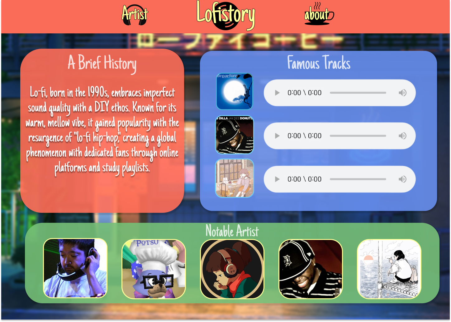
Home, About, Artist. Each page has one job. Home sets the atmosphere and invites you in. About tells the story of where the sound came from and what defines it. Artist is where you go listen. Splitting it this way kept every page short enough to feel unhurried, which a single long scroll couldn't do.
02
The Background Was Non-Negotiable
A looping ramen shop in the rain sits behind the entire site. It sets the tone before a single word is read and does the work a hero section would normally do. Everything else is layered on top with enough transparency to let it breathe.
03
Cards Instead of Sections
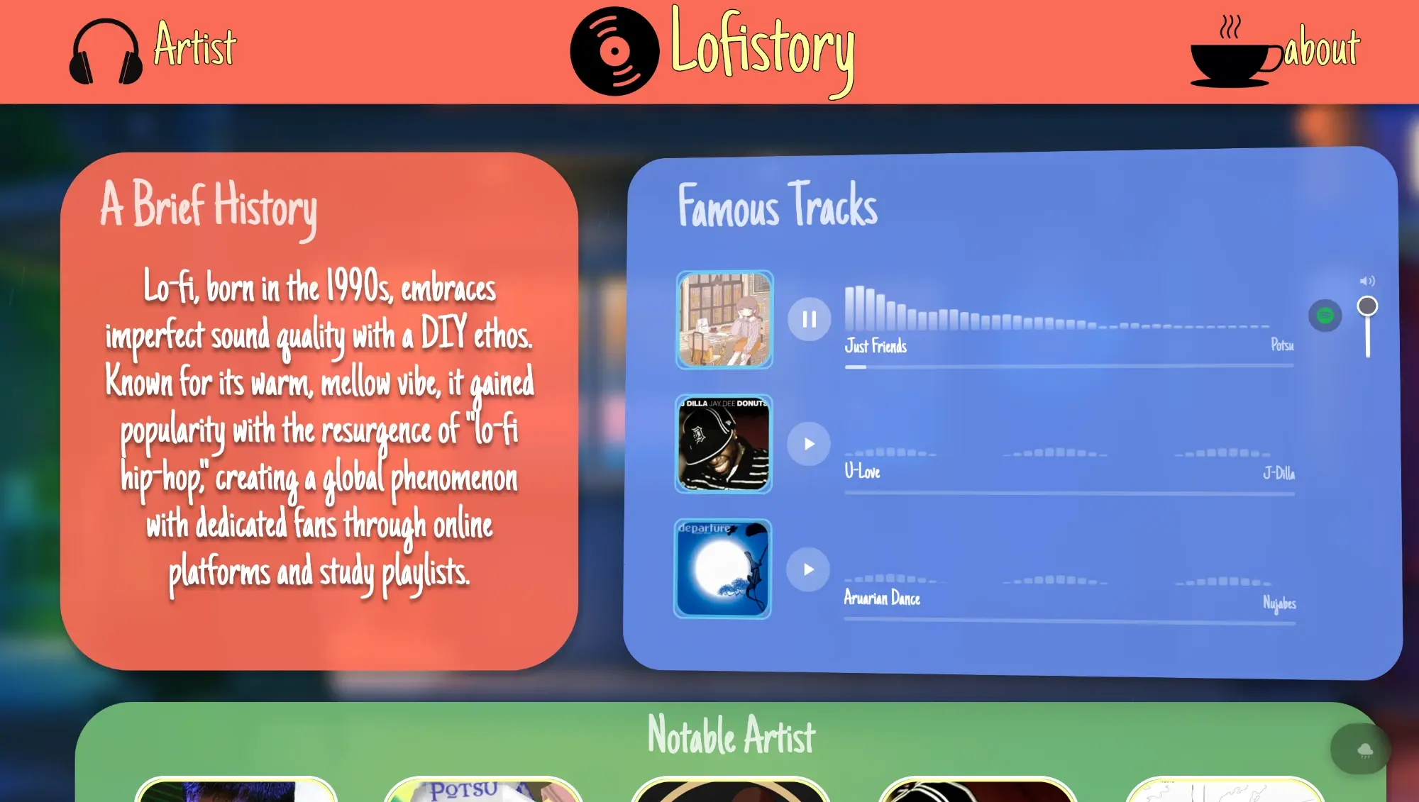
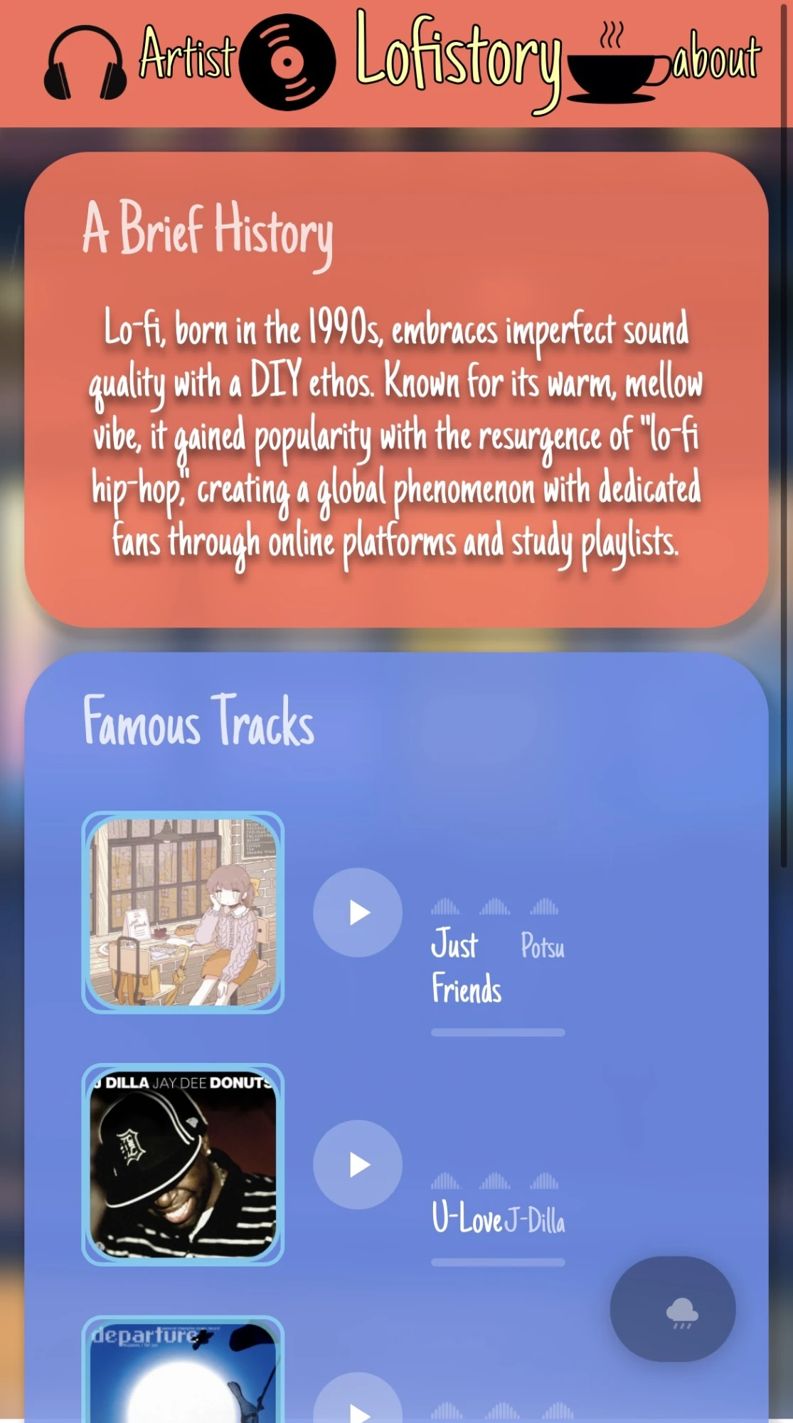
Information lives in playful, loosely stacked cards rather than rigid page sections. Each card holds one thing: a track, a producer, a convention. It mirrors the way lo-fi playlists are assembled, one small piece at a time.
04
Hand-Drawn Type
Lofistory
Headers run in Just Another Hand, a handwritten font that echoes the sketchy, homemade quality of lo-fi cover art. Body text stays clean and readable so the personality never costs legibility.
05
A Palette Pulled From the Art
Coral, cornflower blue, and sage green, sampled straight from the live screens, with a pale cream for type and a deep plum instead of true black. Nothing pure white, nothing pure black. Everything stays soft enough to feel handmade.
06
Real Artists, Not Screenshots
The Artist page pulls from Spotify rather than a hardcoded list. Album art, names, and links stay current without me touching the content, and every card goes straight to the music. The genre is alive, so the page should be too.
Build
A design about restraint deserved a build to match. The site runs on a small set of React components. I used cards, a card grid, a header, the ambient background layer, and React Router handling the three routes. The Artist page calls the Spotify Web API on load and renders the results into cards, so album art, artist names, and links stay accurate on their own, with a direct button on every card to open the track in Spotify. The looping GIF is optimized so the atmosphere doesn't cost load time.
Wiring up the API was the part that turned this from a mockup into a product. Handling auth, structuring the response, and rendering it inside cards I'd designed without it in mind forced a few layout decisions I wouldn't have made on paper. The album art became the visual anchor of every artist card, which was better than what I had drawn.
Building it myself meant the details I cared about in Figma survived contact with a browser. The card spacing, the transparency over the background, the way type sits against the grain. Those get lost in handoff, and there was no handoff.
Home
Artist
About
Reflection
01
Restraint Is a Decision
Lofistory is the smallest project in my portfolio and the one I come back to most. It taught me that designing for feel is a different muscle than designing for a task, and that the two aren't in competition. Restraint is a decision. Warmth is a decision. Leaving something out is a decision.
02
The Figma File Isn't the Finished Thing
It also settled something for me about code. Turning a mockup into a running site changed my relationship to my own designs, and connecting it to a live API made that shift permanent. I stopped thinking of the Figma file as the finished thing.