Time Is on the Menu
Designing wait-time transparency for students who can't afford to guess
PROGRAM
Google UX Design Certificate
ROLE
Solo UX/UI Designer
PLATFORM
Mobile
TIMELINE
2025 – 2026
Context
Thirty-three minutes and fifty-six seconds. That's how long it took to get the sandwich I ordered at UCF's Student Union. I'd missed my bus, I was late to class, and I didn't even have time to enjoy the thing without missing more of the lecture. Nobody had done anything wrong. The kitchen was slammed, and the self-service kiosk I ordered from just didn't tell me.
That's the whole problem. Campus ordering interfaces let you order, but they don't help you decide. For a student with fifteen minutes between lectures, the question isn't "what do I want," it's "can I get it and still make it to class." Knourish is a mobile ordering concept for the UCF campus built around answering that before you commit.
Overview
Project Type
Google UX Design Certificate / Mobile App Concept
Problem
Campus ordering apps give students no visibility into wait times, so every order is a gamble against their schedule. Time-pressured students skip meals or risk being late.
Solution
A mobile ordering app that surfaces an Estimated Wait Time before checkout, backed by a Low Wait / Busy / Packed status system and a Leave By prompt at confirmation, so students can plan around when they need to go.
My Role
Solo UX/UI Designer (Research, Competitive Audit, Empathy Maps, Personas, User Flows, Storyboarding, Information Architecture, Wireframing, Design System, Logo, High-Fidelity Prototyping, Usability Testing)
Tools
Figma, FigJam, React, Claude with Figma MCP
Research
Before designing anything, I built a research plan around one question. How do UCF students actually decide where to eat between classes, and what goes wrong? I ran a ten-question survey on ordering habits at the Student Union, followed by short follow-up interviews with respondents who'd been late or missed transit because of an order.
The Survey
3. Have you ever been late to class, a meeting, or missed transit because a food order took longer than expected?
Yes / No
7. Have you ever skipped eating because you weren't sure you had time?
Yes / No
Plus 8 more questions on ordering frequency, break length, pre-order confidence, and ordering channel.
58%
have been late to class or missed transit because an order took longer than expected
83%
have skipped eating entirely because they weren't sure they had time
2.5 / 5
average confidence in the wait times campus ordering shows, when it shows any at all
100%
said knowing the wait beforehand would change where they chose to eat, at least sometimes
Self-service kiosks were the single most common way respondents ordered (58% of the 12). Among just that group, the pattern got worse:
85.7%
of kiosk users have been late to class or missed transit
100%
of kiosk users have skipped eating entirely
A journey map built around Fez, the primary persona, traced how a single lunch order escalates from anxious to frustrated across four stages, and that emotional arc drove the rest of the research.
That research led to a few key insights:
The Problem Isn't Ordering, It's Deciding
Students consistently know what they want. What they don't know is whether they have time for it. The friction lives before the order, not during it.
Time Pressure Is the Only Fixed Variable
The gap between classes doesn't move. The wait time does. Students are deciding with one known number and one hidden one, and the hidden one decides everything.
Skipping Is the Default Fallback
When a student can't gauge the wait, the safest move is not to eat. Uncertainty costs meals, not just minutes.
The Apps Solve the Wrong Half
I audited Transact, the campus ordering system, against Uber Eats. Both had polished menus and checkout. Neither surfaced wait time, where the decision happens.
Competitive Audit
I audited Knourish against the two apps it would actually compete with for a student's attention. One was Transact, the existing campus system; the other was Uber Eats, the commercial app students already trust and compare everything else to.
The gap was the same across every criterion. Campus apps had the payment infrastructure commercial apps don't need, but none of their UX polish. Knourish's opening was never beating Uber Eats on restaurant variety. It was being the one app that actually told a student how long they'd wait.

Transact (Campus System)
Minimal wait-time transparency, just a static "ready" notification. Navigation is cluttered with hidden menus, and screen-reader support is inconsistent. Its one edge is direct integration with student ID and meal funds.

Uber Eats (Commercial Benchmark)
Dynamic, real-time countdowns and an intuitive, search-driven interface set the bar for polish. None of that logic is built for a 15-minute gap between classes, though.

Knourish (The Opportunity)
Live EWT tied to campus walking time, a clean card-based UI, and one-tap ordering for saved favorites. WCAG-compliant contrast, built around motor-friendly interaction.
Who I Designed For
Fez is the primary persona, a student with back-to-back classes and a tight window who needs to know, fast, whether an order is realistic. Fez isn't browsing. Fez is deciding.
Vega is the counterweight, an HR director coordinating meals for a busy office who runs into confusing interfaces and customization anxiety, the fear of getting an order wrong when it's for other people. Vega kept the app honest for anyone ordering with more at stake than their own lunch.
Fez's flow drove the core design. Vega's kept the customization and menu screens from being an afterthought.
The One Feature That Mattered
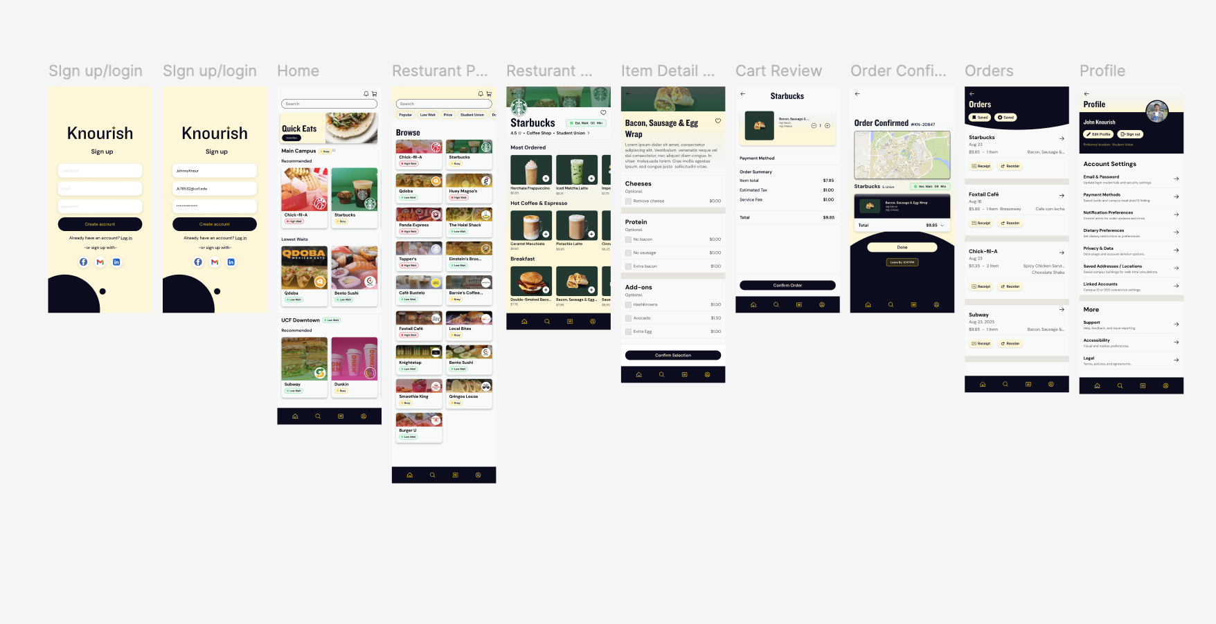
Everything in Knourish serves the Estimated Wait Time. Rather than a number buried on a confirmation screen, EWT shows up where the decision happens, on the restaurant card, before you tap in. A three-level status system (Low Wait, Busy, Packed) gives an at-a-glance read, and the specific estimate sits beside it. A student scanning Home can rule out half the options in two seconds.
At the other end of the flow, the confirmation screen tells you when to leave. Not just "your order will be ready in 12 minutes," but a Leave By time that closes the loop on the whole problem.
The information architecture stayed deliberately flat to protect that speed. Just four top-level nodes, Home, Browse, Orders, and Profile, with persistent search available everywhere. Home shows restaurants by context (what's fast right now); Browse is for looking deliberately. Nothing else earned a place unless it got a student to a confident decision faster.
Real-World Considerations
A wait time is only useful if it's accurate, and only viable if it doesn't make anyone's job harder. Before going further, I had to work out how Estimated Wait Time would actually be calculated, how it would reach students, and what it would ask of the staff behind the counter.
Each estimate comes from the queue, adjusted for how many stations are working and learned from how long orders actually take. It's rounded up and shown as a range because a wait that ends early feels like a win, and one that runs long is the exact problem Knourish exists to solve.
Staff takes on almost nothing new. They already mark orders ready, and that tap is what keeps the estimate honest. When a rush hits faster than the numbers can catch up, they can flip a restaurant straight to Packed.
Design System
Knourish is a UCF product, so it wears UCF colors on purpose. Black and gold (#FFC904) as the core palette, with a dedicated set of status colors for the Low Wait / Busy / Packed system so the wait-time signal never competes with the brand.
Knockout for display, Inter for body. An 8pt spacing system. Phosphor Icons in Regular weight. The component library covers buttons with variants, input fields, restaurant cards, busy indicator chips, the EWT display, and the bottom nav.
The logo is a circle with a bowl in the lower half, a K lettermark at the center, and a four-pointed star accent, nodding toward the product's affiliation with food, UCF, and our moniker all at once. Knockout carries the wordmark.
Prototype
Digital lo-fi wireframes covered the full core flow, including Login, Home, Browse, Restaurant, Menu, Item and Customization, Confirm, and Checkout.
The high-fidelity prototype carries the full persona journey. Users land on Home, scan wait times, pick a spot, build an order, confirm with a Leave By time, check out, and track it. Every screen is built from the component library.
To test with real interactions instead of hotspots, I used Claude with Figma's MCP to translate the high-fidelity screens and design tokens into a working React prototype. I directed the structure and reviewed every component against the Figma source; Claude handled the boilerplate.
Reflection
One Problem, Fully
My instinct on earlier projects was to design everything. Knourish was the first time I picked one problem and refused to let anything else in. The app is better for it, and so is the case study.
The Decision Is the Product
Ordering was never the hard part. Once I understood that the real user moment was the decision before the order, every screen had a clear job. I want to find that moment earlier on every project.
Brand as Constraint
Designing inside UCF's identity could have felt limiting. Instead, it gave the app an immediate sense of place and purpose. Serving that identity was crucial to having Knourish thrive.