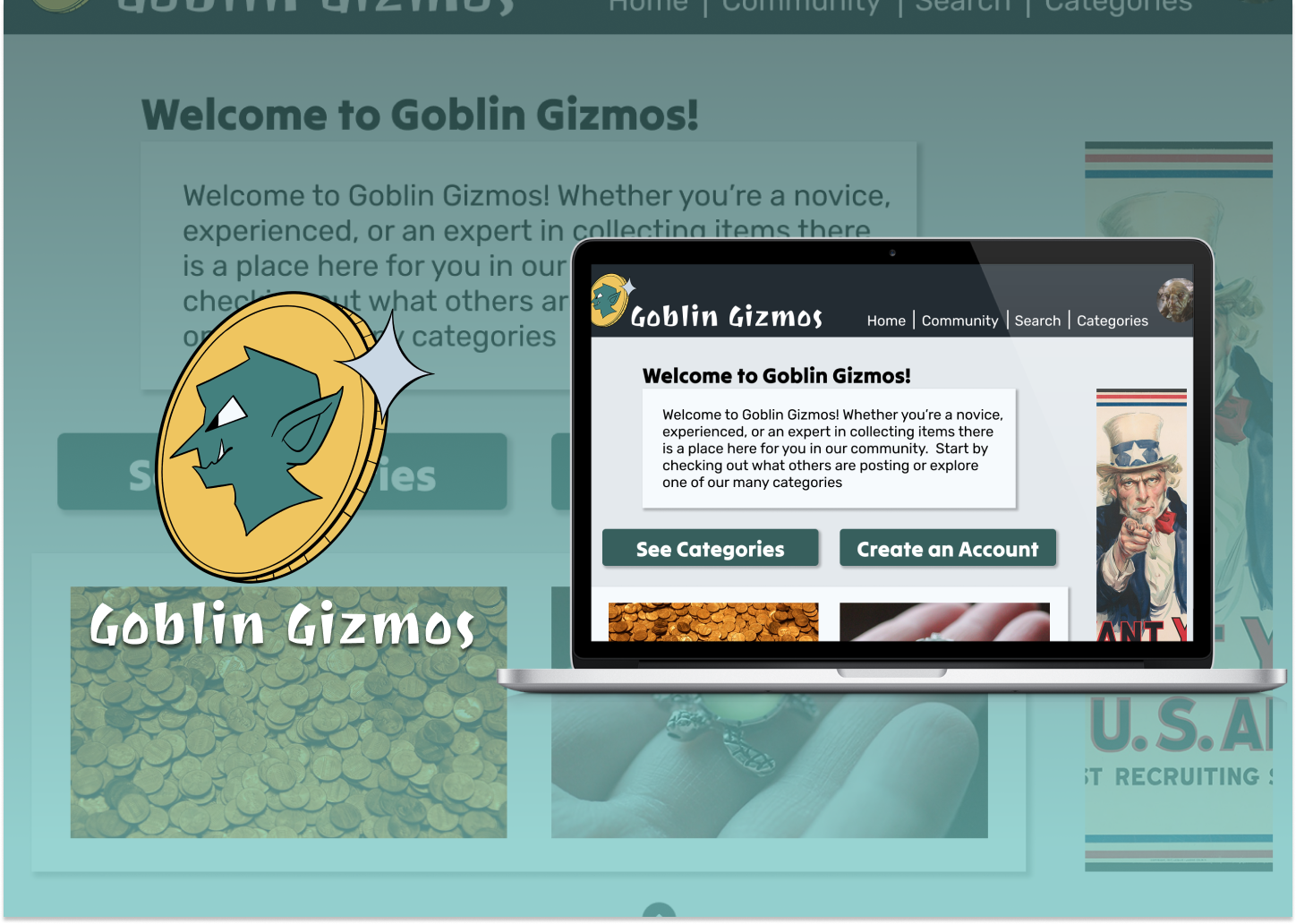
A Digital Shelf for Every Kind of Collector

Building a community platform where any collection belongs

PROGRAM

UCF Capstone Project

ROLE

Design, UI, and Branding Lead

TEAM

Team of 5

TIMELINE

Aug 2025 – May 2026

Building a community platform where any collection belongs

Context

The team didn't have to go far to find inspiration. We just looked at our own shelves. Vinyls, figurines, business cards, blind boxes, books. Each of us collects something, and each of us had the same quiet frustration. There was nowhere online to show it all off the way we wanted to. The platforms we found were too limited, too cluttered, or looked like they hadn't been touched since 2009.

We wanted something warmer. Something like Letterboxd, but for everything. And we didn't want to stop at a prototype. Over two semesters, a five-person team took Goblin Gizmos from a research question to a working site with real accounts, real uploads, and a real database. I led design, UI, and branding, and wrote front-end code alongside the team.

Overview

Project Type

Capstone / Product Design and Full-Stack Build

Problem

Collector platforms are dated, siloed to one niche, and often paywalled. Collectors had databases to maintain, not places to connect.

Solution

A social, community-first platform with a two-layer collection system and a bounty board for trading. Designed in Figma, built on PHP and MySQL, validated and responsive.

My Role

Design, UI, and Branding Lead (Competitive Analysis, Interviews, Use Cases, Information Architecture, Brand Identity, Prototyping, User Testing, Front-End Development)

Tools

Figma, Adobe Photoshop, HTML, CSS, JavaScript, PHP, MySQL, GitHub

Process

Click a stage to jump to that part of the case study.

Competitive Audit

Interviews and surveys with collectors across different hobbies confirmed there was a real gap. Nobody wanted another spreadsheet. They wanted something quick to update, easy to browse, and genuinely social. A place to connect over the things they love.

Five platforms got the same treatment next. What worked, what didn't, and who they were actually for.

Colnect

A deep wiki and country-based sorting make it powerful for narrowing down specifics, but the navigation feels dated and its top-level categories aren't alphabetized, which trips up new users.

Delcampe

A large, well-sorted catalog with built-in bidding and payment filtering, more current than most competitors but still fairly cluttered.

Collectors Corner

Limited to coins, currency, cards, and stamps, with a dated interface that doesn't extend to any other kind of collecting.

Colleconline

A blog and community angle gives it some insider credibility, but there's no clear way to actually buy or bid on an item, and a confusing subscription model buries the content further.

MyFigureCollection

Free, with a user-contributed database, forums, and messaging that make it feel alive, but the UI is dated and it's built almost entirely around figurines.

Primary User Flows

To understand what collectors actually needed, I mapped out five key flows. These later became the test script for usability sessions.

01Login

Existing User

Access the app and their account.

Tap “Log In”Enter Email/PasswordTap “Submit”System verifies credentialsDirected to homepage

02Access Profile

Existing User

Access the current version of their profile.

Navigate to “Account”Tap “Account Info”

03Browse Categories

Existing or New User

Access the categories list to further browsing and curiosity.

Navigate to “Homepage”Tap “Get Started”Tap “See Categories”
AltOpen Nav Bar or burger menuTap “Categories”

04Add New Trinket

Collector

Successfully catalog a new trinket.

Log inTap PlusEnter detailsSave

05Contact Support

User Facing Trouble

Get in touch with the support team to resolve an issue.

Scroll to FooterTap “Support”Tap “Contact Us”Follow instructions
The Decision That Shaped Everything

The structural choice we were most deliberate about was the two-layer collection system. A user has collections (say, books), and within each collection they have individual items (a first edition, a worn paperback with notes in the margins). It sounds simple, but it solved the core problem every competitor had: how do you let one person hold vinyls and figurines and books on the same shelf without the organization collapsing? Each trinket gets room to express its own history. The broader structure stays clean. Nearly every downstream decision, from the data dictionary to the database schema, traced back to this.

Brand

Landing on a direction was one of our earliest struggles. Once Goblin Gizmos clicked as the name, everything fell into place. Goblins gave us mischief, treasure obsession, and community. I ran with it.

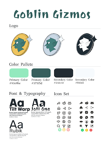
Teal and mint primaries, a near-black secondary, off-white background. Clean and modern without being sterile, with just enough green to feel fantastical. Tilt Warp for headers (bold and a little chaotic in the best way), Joti One for the logo, Rubik for body text. Our design artist built the mascot in three variations for flexibility across contexts.

Add style guide
Add mascot

Design

The lo-fi prototype covered the primary journeys, sign-up, home, category browsing, adding a trinket, the community tab, and accessibility settings. Keeping it rough was intentional. It made it easier to cycle ideas if need be.

A round of user feedback on the lo-fi surfaced friction we hadn't anticipated. Button placement moved, calls to action got clearer, and the category browser got a more prominent path from the home page. The high-fidelity prototype brought the full identity to every screen.

Build

The stack was HTML, CSS, JavaScript, PHP, and MySQL. PHP ran the server side, with encrypted passwords and different access levels for visitors, users, and admins. MySQL held everything from profiles and collections to posts and images. Five of us split ownership by feature, so two people were rarely touching the same file.

Responsiveness runs on three breakpoints, mobile under 600px, tablet from 600px to 1000px, and desktop above. On mobile, vertical menus replace dropdowns, buttons scale up for touch, and content is prioritized to cut clutter. Accessibility carried through from design into code, contrast, alt text support, and in-app controls for font size and color scheme. The site passed W3C Markup Validation.

The design held up in code. That was the point.

View in Figma ↗

Testing

Five testers worked through each of the five use cases on the Lo-fi build, rating every one on navigation, features, and organization from one to five. The same five came back once the Hi-fi was ready and reacted to it directly, so every major fix got validated twice, once on paper and once in the real interface.

No Way to Post

Every one of the five testers hit the same wall. There was no visible button for adding a new trinket or bounty anywhere on the homepage, the community tab, or the categories tab. Five-for-five agreement on one missing button made it the clearest fix of the whole round.

One Page Too Many

Settings, accessibility, and logout all lived behind a standalone account page, and every tester flagged it as a dead end. They proposed the same fix independently, turning it into a dropdown reachable from any page instead of a destination you had to navigate to.

Report, Buried

All five testers expected to report a user from that user's own profile and report a post from the post itself. Instead both lived on a separate page no one found on their own, a safety feature that only works if people can actually reach it.

The Small Stuff Added Up

No one could recover a forgotten username or password. The bounty and trinket search bars looked identical with no way to tell them apart. Testers also kept reaching for a comment box at the bottom of a post that wasn't there yet. None of these broke the product on its own, but together they were enough to slow down almost every session.

The core use cases, browsing, saving, filtering, held up well across every session, most scoring a clean five on navigation and organization. What needed work clustered around account access and content controls, missing recovery options, a redundant settings page, reporting tools people had to hunt for, the same handful of gaps nearly every tester flagged on their own.

Final Thoughts

“The broad and important pieces are there, just a few nitpicks and a couple features and it is good.”
-User 1, usability testing

Reflection

Goblin Gizmos was the most collaborative and most creatively demanding thing I've worked on, and most of what it taught me was about the parts of design that don't show up on a screen.

The Documents Are the Design

I underestimated how much of the work lives in the documents. The use cases, the data dictionary, the information architecture. These weren't formalities. They were the scaffolding that held the design together, and when we skipped a step we felt it later in the build.

Identity Is a North Star

We had a concept we believed in but couldn't agree on how it should look, and once we committed to the goblin direction, everything accelerated. A strong visual identity is a creative north star, and you lose a lot of time without one.

Design for the Edges

The testers who challenged our assumptions most were the ones we almost didn't include: the accessibility-conscious user, the person adding a trinket from their phone, the newcomer who doesn't know what a bounty is. Designing for them made the core experience better for everyone.

It Was a Democracy

I didn't always get to set the tone, and that was fine. I'm as proud of how we built it as what we built. I'm leaving this project with a clearer sense of who I am as a designer and what I'm capable of when I'm working with the right people. That's the most valuable treasure I could ask for.

Back to top :D